Sign-in Changes | Terms of use screen reader | Observer meta-research | Taxonomy card sort | Experience research
VA.gov Identity | Unified terms of use, screen reader prototype
Objective: Create a single, unified, terms of use page across all VA digital services. I specifically including screen reader participants from the start to make sure we weren’t putting up a blocker for anyone to access their account.
My Role: I led this research as the lead UX researcher on the multidiscipline VA.gov identity team. I had two other researcher on my team that assisted in planning, moderating sessions, note-taking during sessions, and analyzing data. Engineers on my team focused on the technical aspects of implemention, while our VA product owner focused on internal political elements, like getting multiple stakeholders across the organization on the same page. I designed this page using the VA Design System and led this product through the VA Collaboration Cycle, and especially utilized accessibility experts when planning and holding sessions with screen reader users.
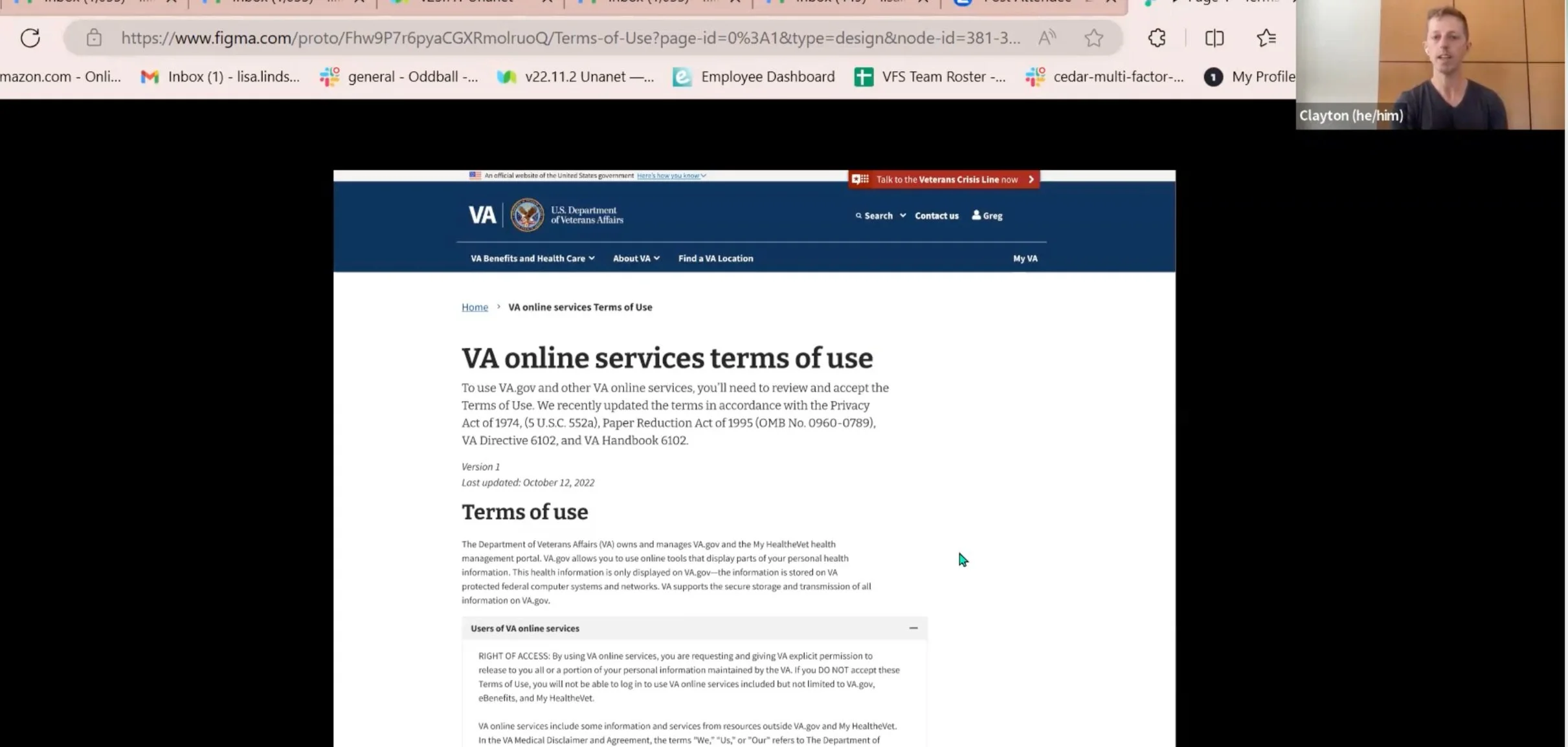
Screenshot of a usability session in Zoom
Time for an update
The VA Office of General Council had been discussing updating the terms of use on VA’s digital properties. VA has several digital properties including VA.gov, MyHealteVet, My VA Health, an a mobile app that each had their own terms of use. Many folks use more than one experience, which meant agreeing to the same terms of use multiple times. My team, as the owner of the sign-in experience, was eager to make this part better. We successfully got all stakeholders on board with the idea of a unified terms of use. Now we needed to make it successful.
Accessibility research first
Terms of use is a potentially blocking point - each veteran must get past it before using their VA benefits. Most products designs should start with accessibility in mind, and even more important here. Well before our front end would have a coded page, we researched with an early iteration prototype - in Figma
I asked the accessibility team at VA to review my research. They especially helped me on the screen reader versions of the conversation guide and prototype. Since Figma had started offering some screen reader functionality, and since I was the first VA researcher using this functionality, I agreed to present what I learned about it.
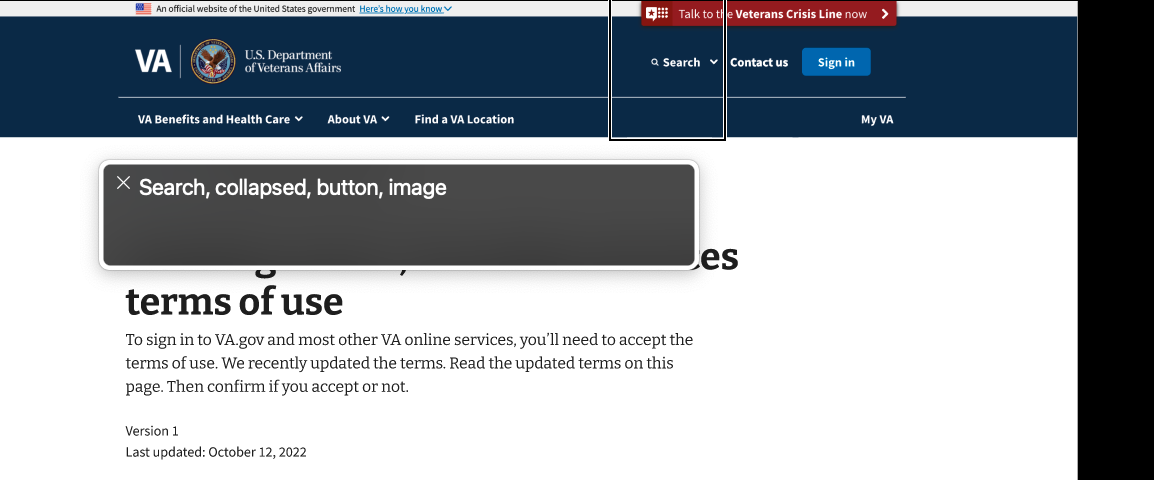
Screen reader text of the Figma design
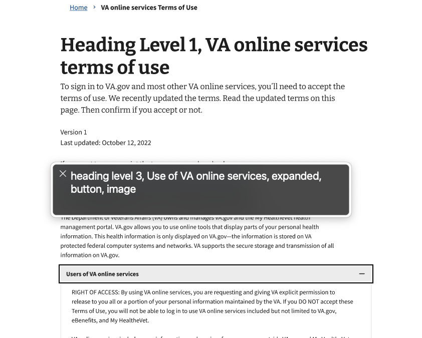
Screen reader text of the Figma design
Figma + screen readers
I found several trade-offs using Figma with screen readers. For example, one way to have a screen reader read off text as a header is to include “heading level [#]” as text content before the text of the header. However, this makes “heading level [#]” visible in the prototype, and not everyone who uses a screen reader is fully or even partially blind.
Another way to have screen readers read off text as a header in Figma is to use an image file with the title of heading. This makes it look fairly seamless at the standard zoom level, but the trade-off is that the screen reader will first announce it as a heading and then as an image, as seen in the screen shot of the screen reader transcript.
Practice makes perfect?
I practiced going through our team’s design with a screen reader to make sure everything worked as the best as possible. Then I asked someone from the VA accessibility team to be a practice screen reader participant. Practicing both the conversation guide and the prototype beforehand, allowed me to iterate further on both before working with real participants.
The Figma prototype didn’t work perfectly for screen readers, but we found our were understanding of the prototype limitations. Even with the tradeoffs, we found some valuable insights to help our team iterate the design. We confirmed the usability of accordions in this usage. And we confirmed that many folks wanted to get to the accept button and move on as quickly as possible. With the constraints put on the design by other stakeholders, we did end up placing the accept button at the very bottom of a still rather long page. But usability testing showed that was ok, if not the best experience. We also closely watched metrics after launch, and saw that the vast majority of folks were finding the accept button.
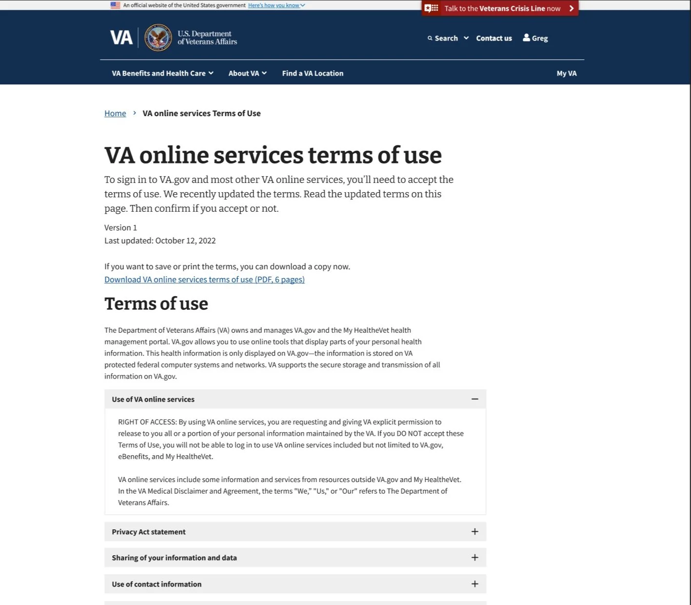
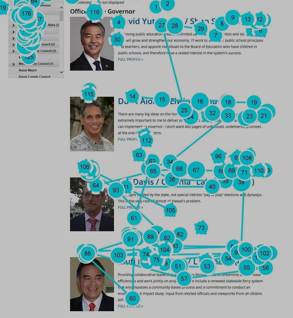
Final terms of use design, live page